Banana Republic
The Magazine
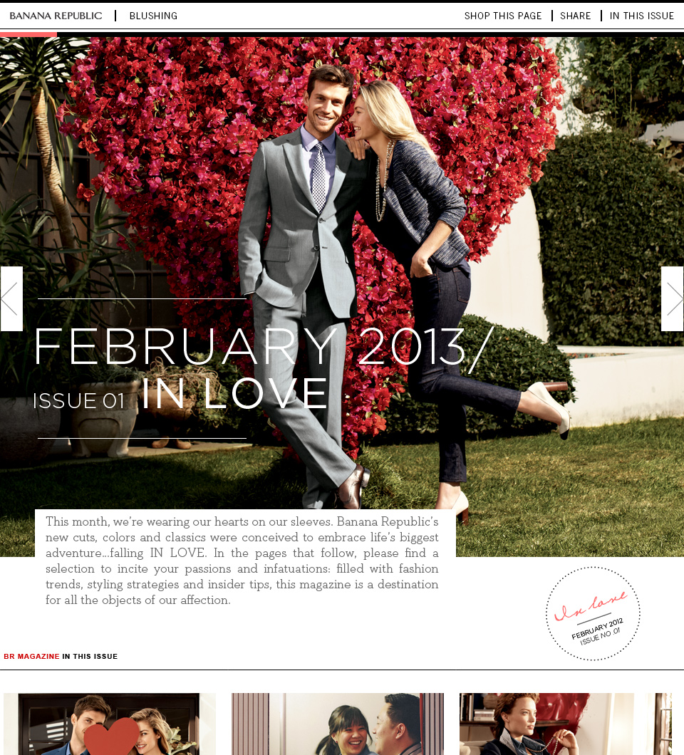
Rethinking the fashion catalogue
Fashion retailers send millions of print catalogues to customers on a regular basis. They are effective, and our goal was to provide a digital version of the same content for the mobile generation.
Banana Republic is a great brand and it was also a good opportunity to work with my friends at the Impossible Bureau again. Translating a design made for the static world of print to the fluidity of digital is not a simple task. It was a long process to achieve the responsiveness and interactivity we wanted, but at the end, we had a beautifully simple experience that worked across screens and devices of all shapes and sizes.
A nimble mindset
Fashion catalogues are full of beuautiful imagery and elaborate use of large type and visual elements. Every page is custom designed to invite readers to browse and explore. In print, it is no problem to use 10 different font styles. But on the web, this approach incurs long load times, and both research and experience have shown that users have no patience for slow experiences. The same goes for images. So one of our big tasks was to slim down visual elements while keeping intact the visual expressiveness that makes the Banana Republic brand what it is. Similarly, page layouts require a different approach, since websites need to be responsive to the size of the users device, as well as it's capabilities. After several iterations, working with grid systems and prototypes, we finally had resolved a lot of these details to create a coherent visual and interactive system that could go into production.
The experience
Simple tap and swipe gestures allowed for intuitive browsing, and blended with the content were various interactive elements, from animations to liven up key content, to sharing & purchasing options.To ensure users always feel in control, we added an expandable, visual table of contents that could be easily accessed at all times.To ensure users always feel in control, we added an expandable, visual table of contents that could be easily accessed at all times.
Bringing what is traditionally a print experience to digital is a challenge that requires sensitivity for the nuances of both mediums. For example, while a print catalogue can easily use 10 different font styles, this would result in an extremely slow load for a digital experience. And while on a printed catalogue, every page can be custom designed, a digital catalogue is much betters served with templated or modular layouts. All those things not only affect production, but also the workflow of content creation. These are hard design problems, which in turn can also be the most rewarding ones.